Project Overview
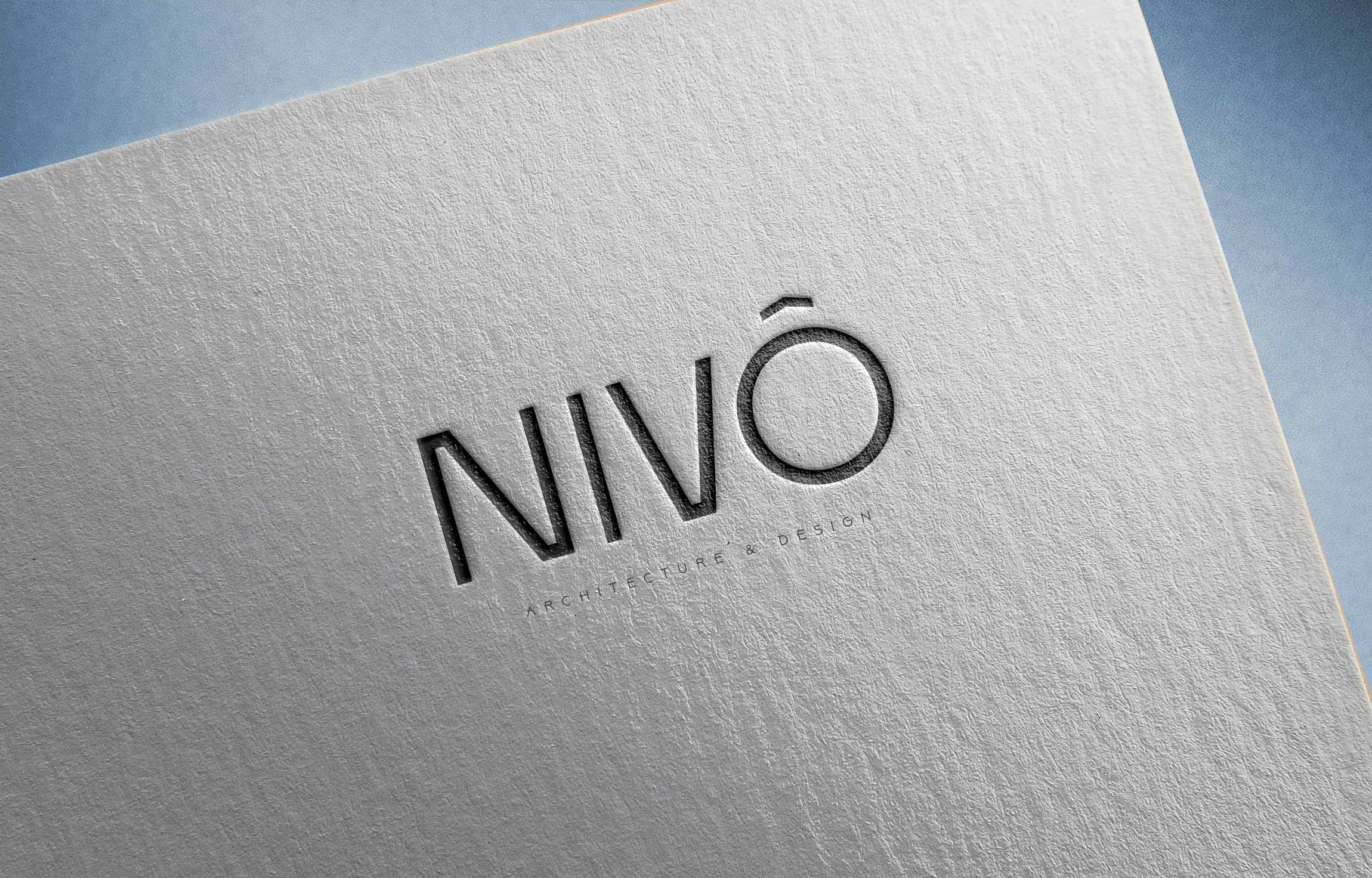
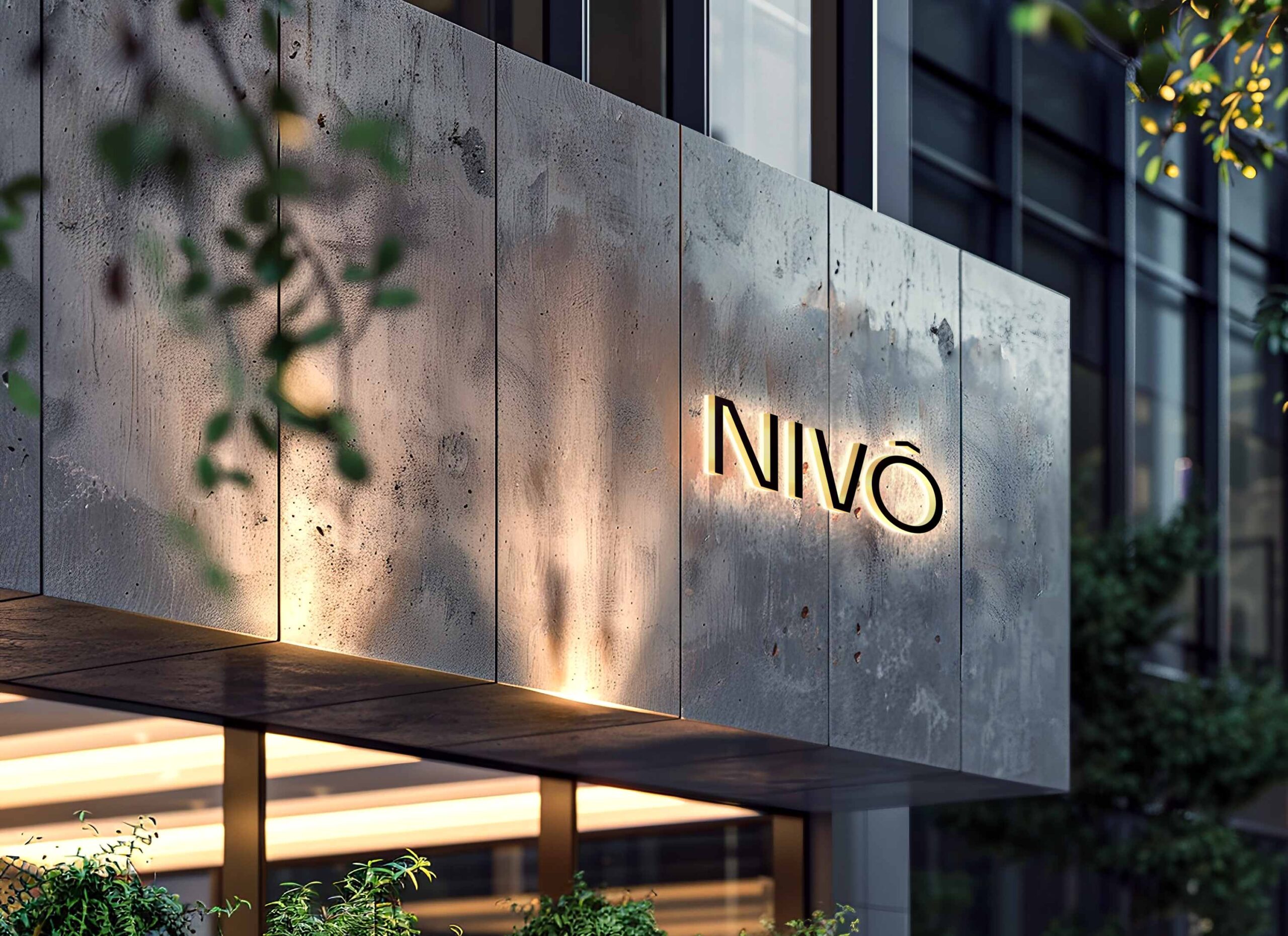
NIVO is a modern brand that needed a fresh, recognizable visual identity to support its long-term growth. My role was to craft a complete branding system that reflects clarity, confidence, and contemporary style, ensuring the brand stands out across both digital and physical touchpoints.
The Challenge
NIVO required a brand identity that would:
Establish a strong and memorable market presence.
Communicate professionalism with a modern and minimal edge.
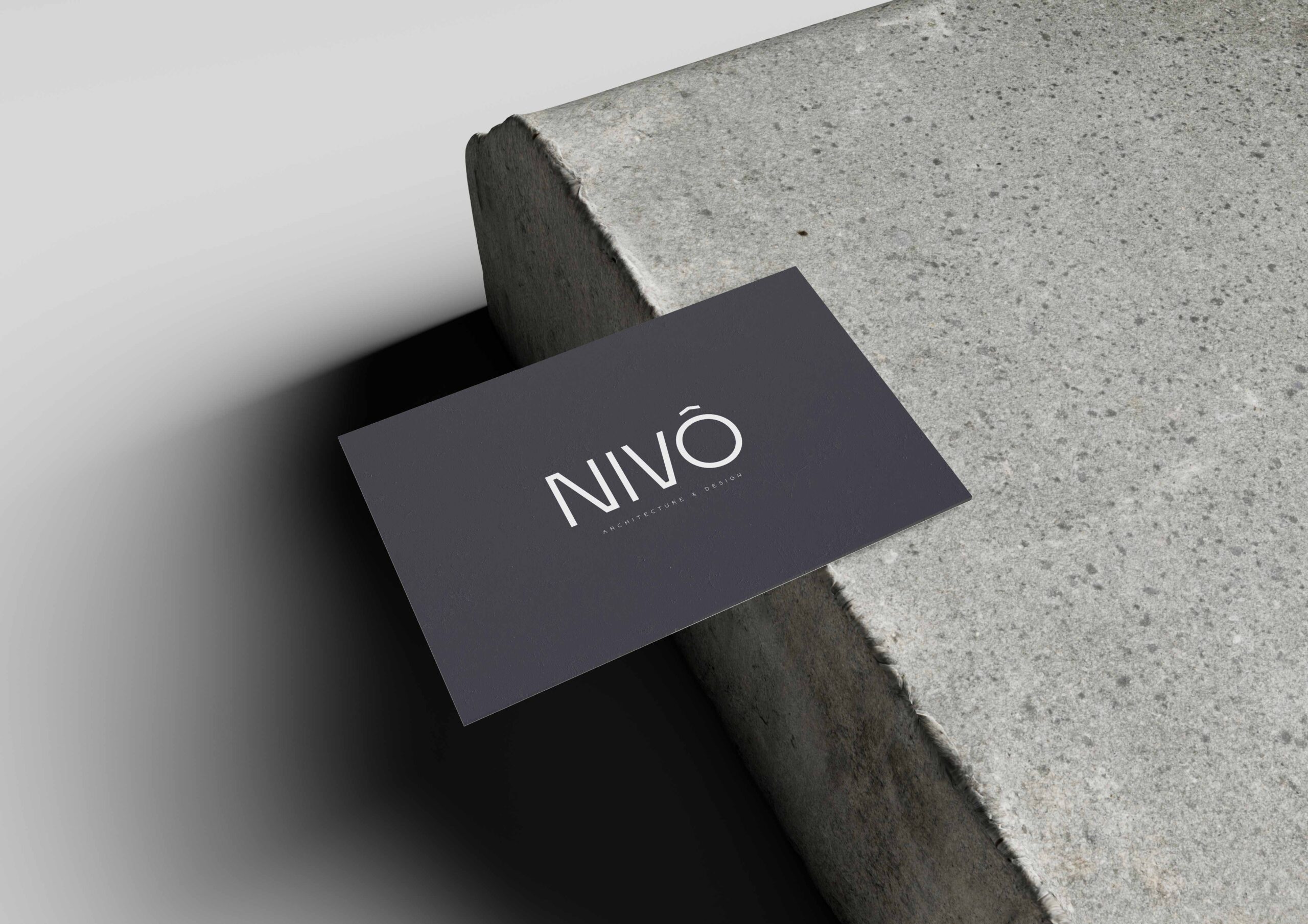
Work seamlessly across packaging, digital platforms, and print materials.
The Process
To bring NIVO’s vision to life, I developed a versatile identity built around clean, modern design principles:
A distinctive logo with a bold yet minimal geometric construction.
A refined color palette designed for high contrast, flexibility, and brand recognition.
A typography system that balances modern aesthetics with readability.
Full brand guidelines to ensure consistency across every use case.
The Result
NIVO now has a strong, timeless, and scalable brand identity that communicates sophistication and trust. The visual system supports the brand’s long-term positioning and provides a solid foundation for future growth.
The Solution
The final branding is clean, professional, and versatile. The logo reflects unity and recovery, the color palette conveys calm and trust, and the overall identity gives United Physio Care a strong, recognizable presence in the healthcare space.
Impact
With its new branding, United Physio Care now has a cohesive and trustworthy identity that aligns with its mission to provide expert, patient-centered physiotherapy care. The updated brand strengthens its visibility, credibility, and connection with patients.


