Project Overview
FAT BRGR is a burger spot built around big flavors, bold personality, and a fun, no-nonsense attitude. My task was to create a brand identity that tastes as good visually as their burgers do in real life — loud, iconic, and instantly recognizable.
The Challenge
The brand needed an identity that would:
Capture the big, juicy, unapologetic energy of the restaurant.
Stand out in a crowded food and fast-casual market.
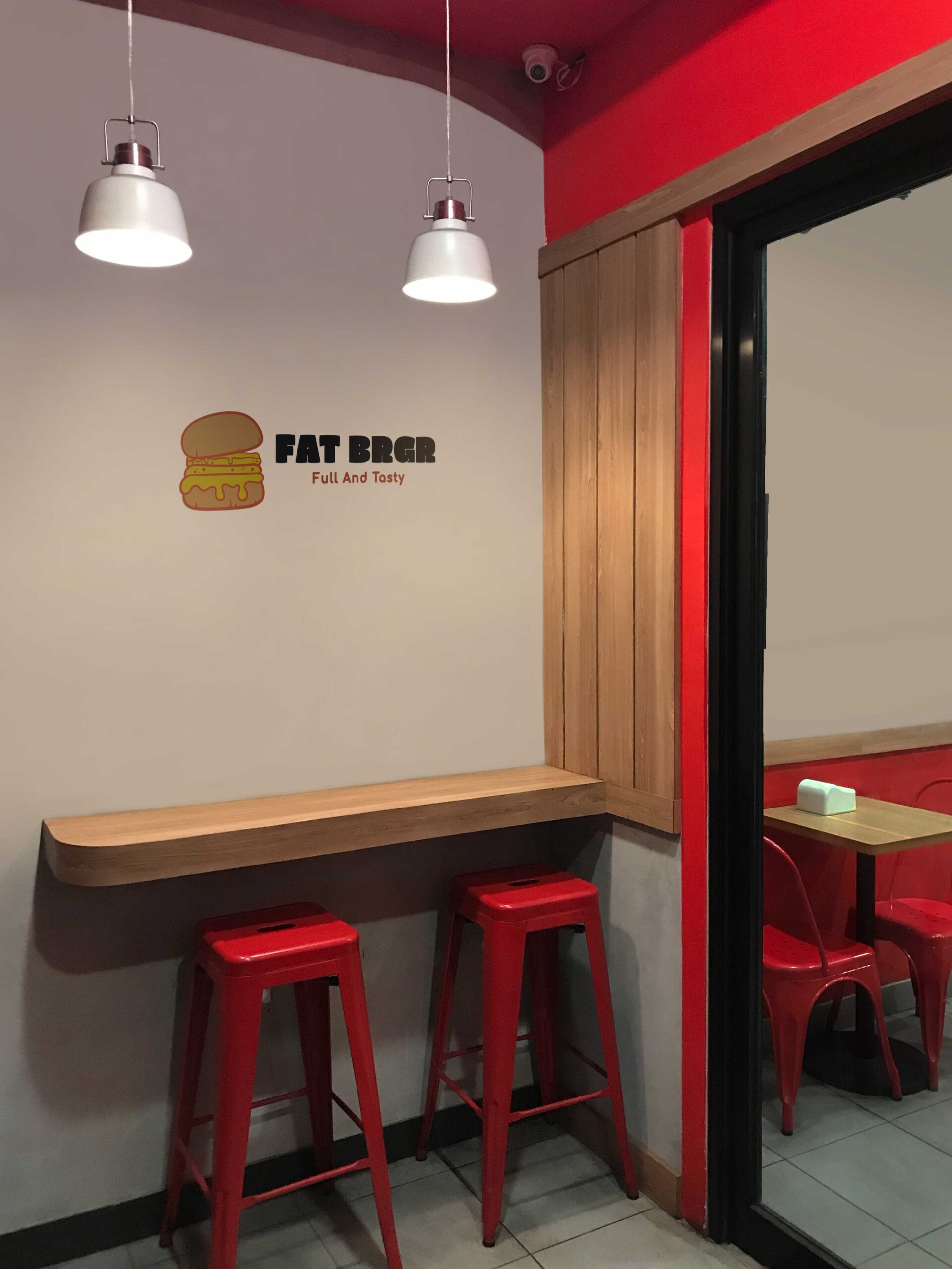
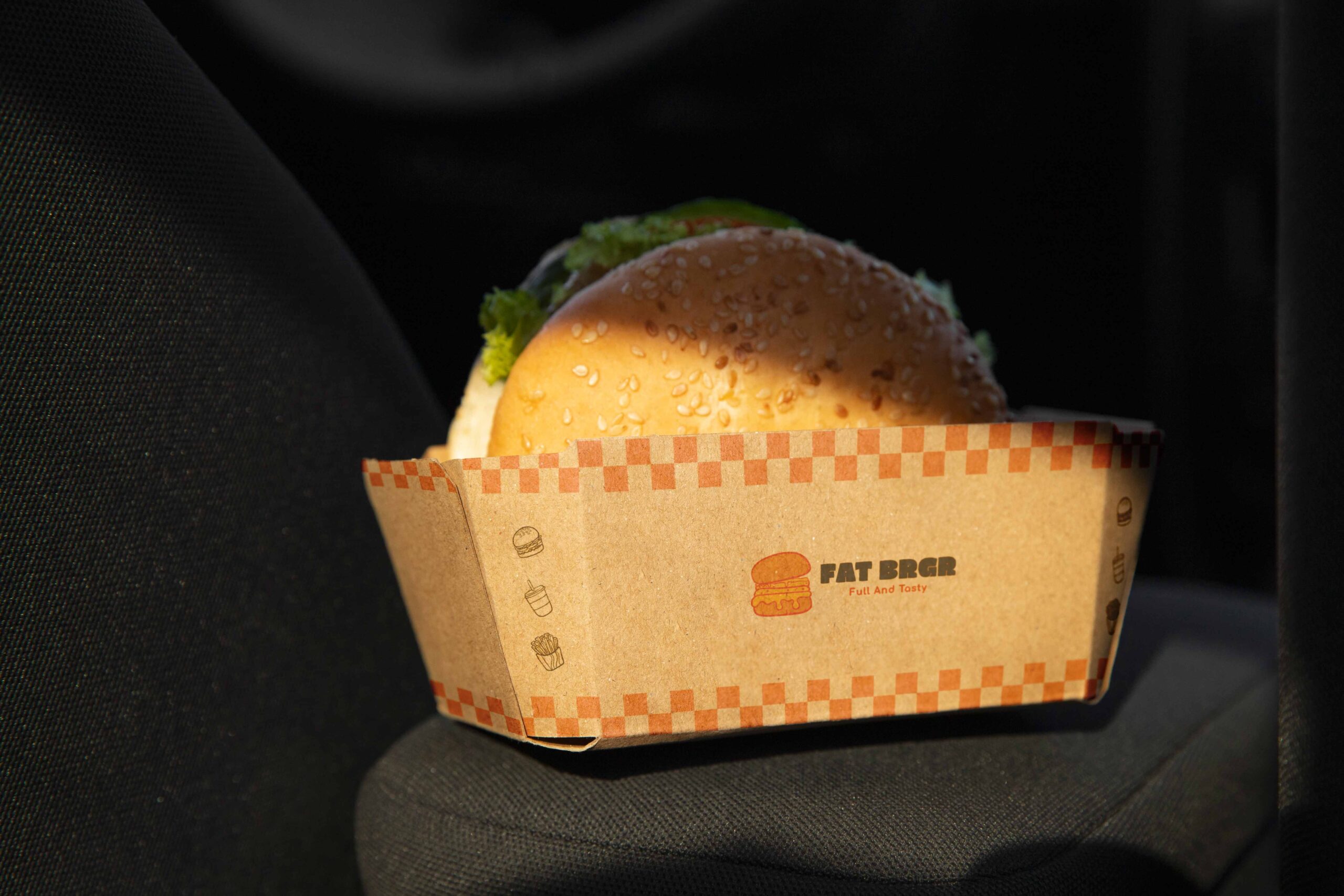
Work across menus, packaging, storefront signage, and social media.
The Process
I developed a visual direction that embraces FAT BRGR’s bold personality from every angle:
A strong, chunky logo that feels flavorful and full of character.
A high-contrast color palette with attitude, perfect for both digital and physical branding.
Playful typography and layout styles that deliver a sense of fun and creativity.
A brand system that remains flexible for promotions, menu changes, and social campaigns.
The Result
FAT BRGR now has a loud, modern, and memorable identity that reflects its personality and elevates the customer experience. The branding brings energy, attitude, and appetite appeal — setting the tone for a burger brand that isn’t afraid to stand out.
The Solution
The final branding is clean, professional, and versatile. The logo reflects unity and recovery, the color palette conveys calm and trust, and the overall identity gives United Physio Care a strong, recognizable presence in the healthcare space.
Impact
With its new branding, United Physio Care now has a cohesive and trustworthy identity that aligns with its mission to provide expert, patient-centered physiotherapy care. The updated brand strengthens its visibility, credibility, and connection with patients.


